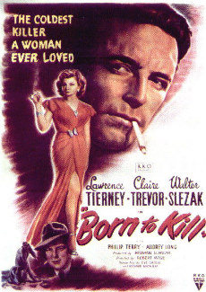
- Posters often featured one character over sized and looking down on the other subjects in the posters
- A woman was often present, featuring the femme fatale on the poster shows that Male Gaze theory was a major part of the films.
- Slanted text
- Many posters featured boxes or areas sectioned off to the other parts of the posters.
- Actors sure names where often in capitals, as many where known by their sure names.
- Dots where often featured between actors names.
- Colors where often black, white or red with very few featuring vivid colours such as blues. Red was used prolifically to show the threat, romance and lust the film featured.


For my poster, I used images from our character photo shoot and edited them to look like they where hand drawn. Next, I used Photoshop to edit the text and also create the section of the poster where the characters are featured. The logo used was created separately and is the same one featured in our film. It uses a warped horizontal arc to match the arc the crown has. We used a royalty free image of a crown as it suited our film companies name ' RELM' which stood for (Raya, Emilie, Luke, Matt). Relm is a play on the word Realm, and the crown shows hints at the king or queen that would rule that Realm.

To help visualize my poster, I added it into a real life scenario with other film posters with a quick photoshop.

No comments:
Post a Comment